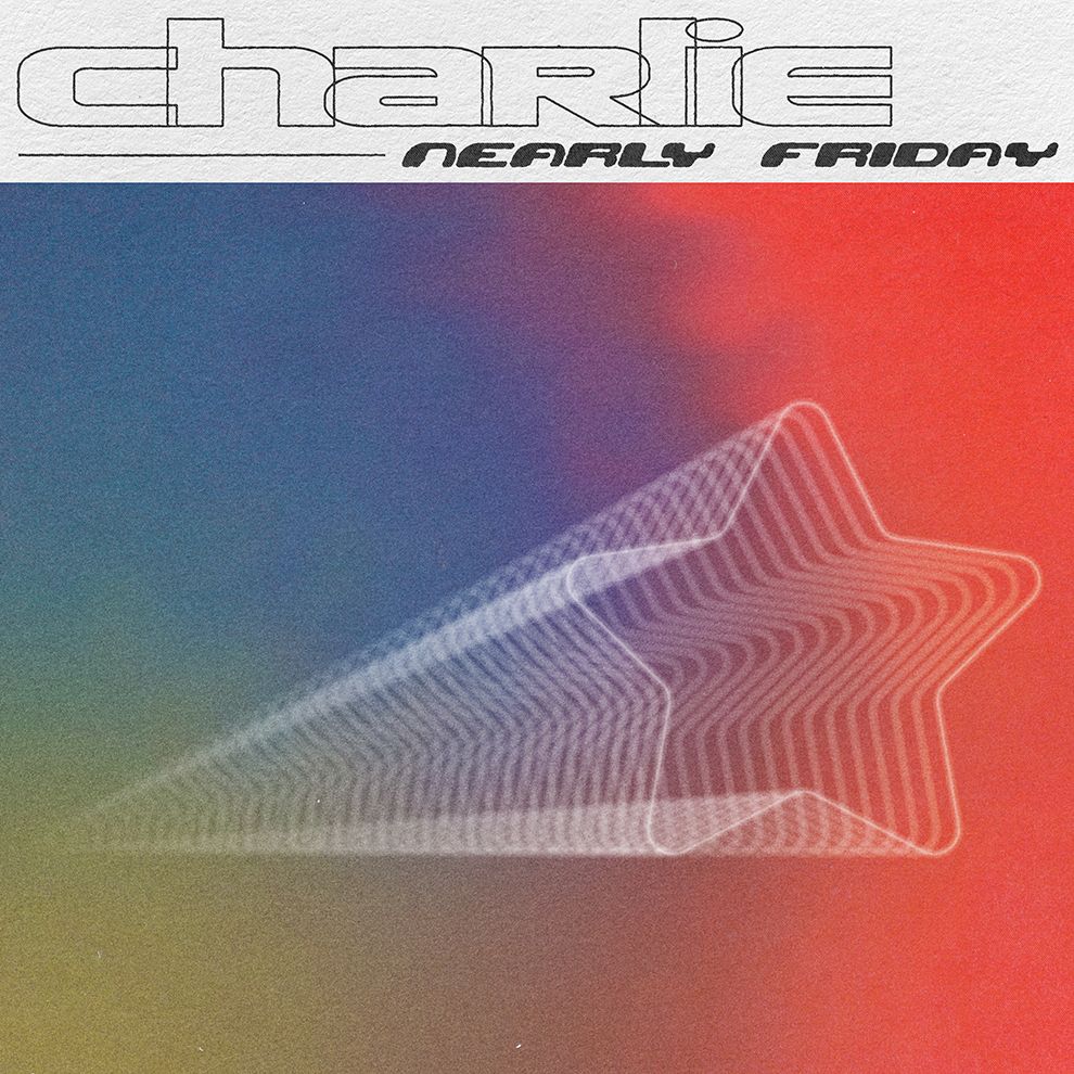
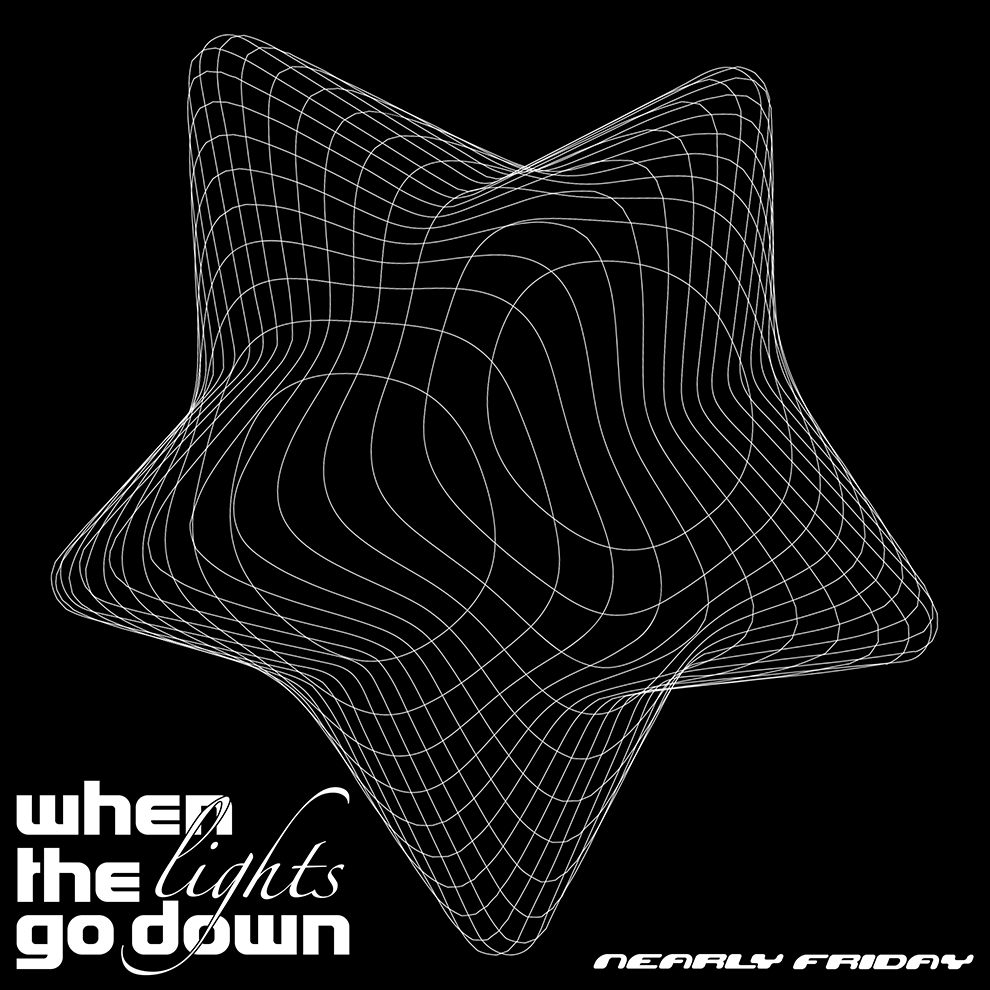
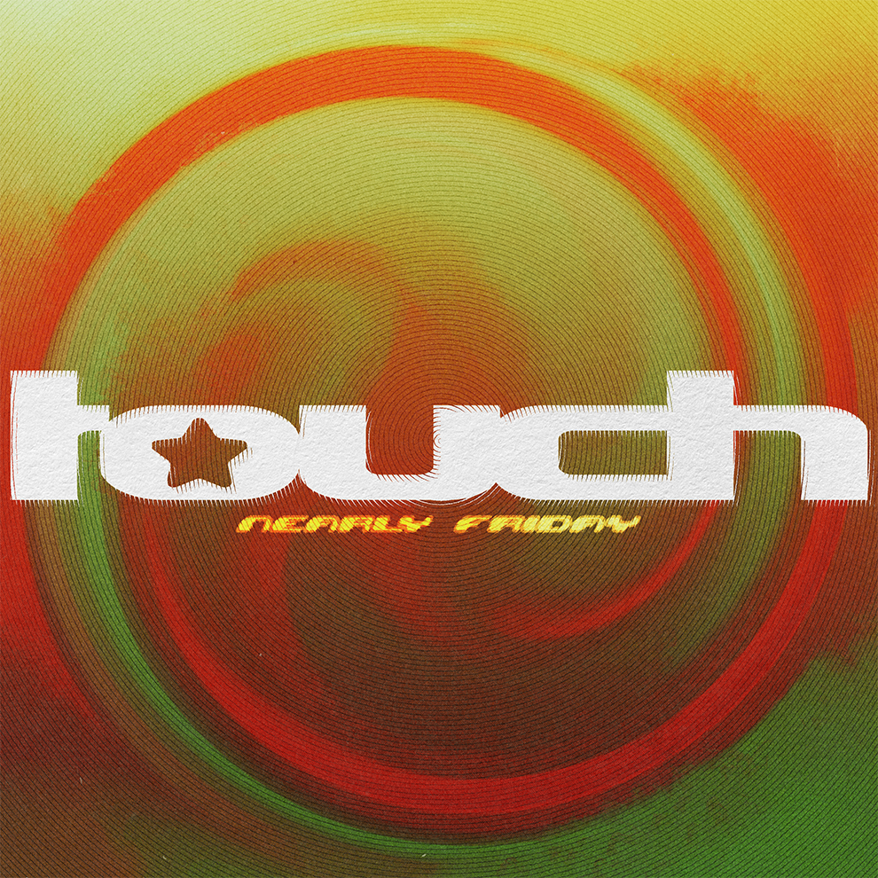
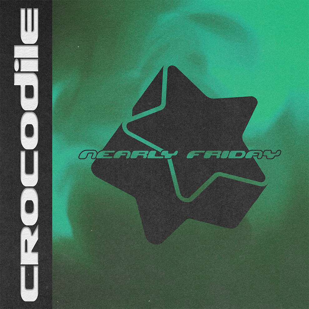
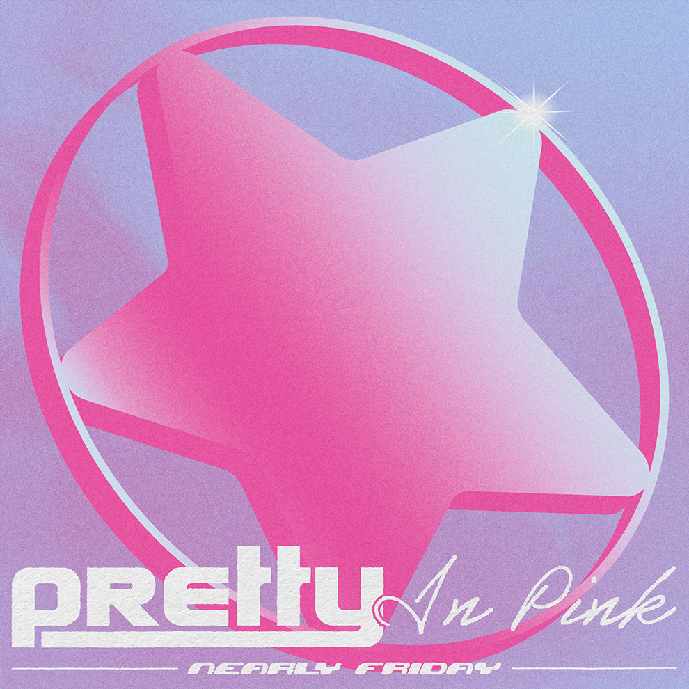
Nearly Friday were looking for a unique logo, incorporating a star and with a Y2K aesthetic. To match this aesthetic, a custom type with bubble-like features was created. Along side the logo, a matching icon to be used for social media platforms.
This look and feel for the band was carried across to each single release, with the star remaining the focus as the bands symbol.
